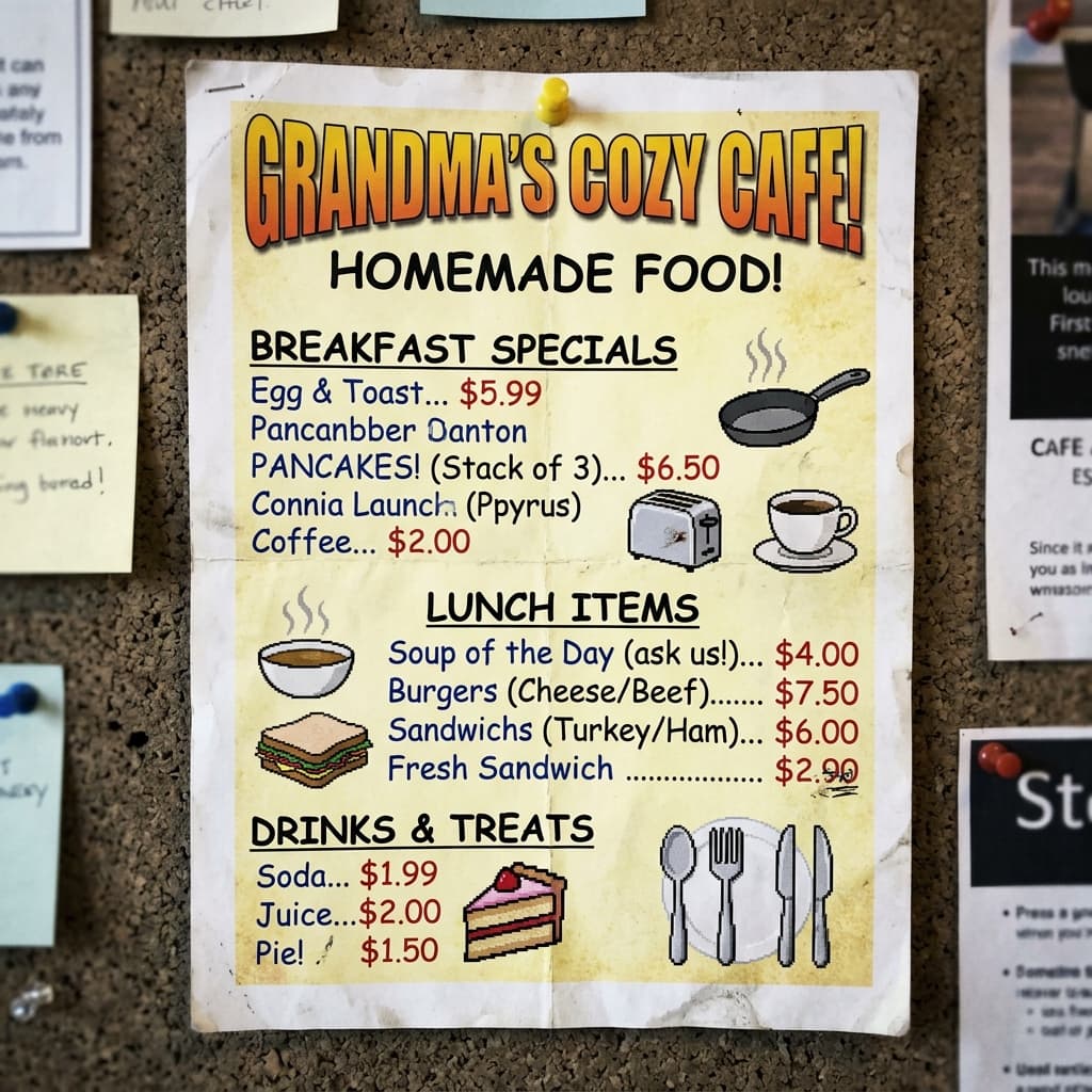
01 // CONCEPT INPUT
A deliberately rough fictional baseline used to demonstrate how generic imagery and weak hierarchy undermine premium pricing.
View frameBrand Makeover Concept
Designed to show how a premium coastal brand system can lift a local venue past a homemade look.
The challenge
A cafe with great food can still look homemade online — generic imagery, no brand system, and menus that undercut premium pricing.
Without a sharper shop window, the venue keeps competing on price instead of perceived quality.
The response
Build a bold, clean brand system that proves the venue is the best spot in town — wave mark, menu, palette, and social templates that travel together.
A concept brand kit: logo, colour system, menu layout, and social templates ready to take live.
Storyboard
A deliberately rough fictional baseline used to demonstrate how generic imagery and weak hierarchy undermine premium pricing.
View frameA deliberately weak fictional wordmark used to test the redesign — poor hierarchy, clip-art energy, and no signage readiness.
View frameThe proposed SVG wordmark uses a custom wave arc to feel premium, coastal, and ready for signage, merch, and digital.
View frameA dark coastal palette and elegant serif typography. Every section breathes so items justify their price.
View frameA five-colour palette and two-font system. Signage, packaging, and social stay consistent without guessing.
View frameDeliverables
Designed to demonstrate
Concept pack that justifies premium pricing through polish
Reusable social templates that keep the look consistent
Menu layout that makes every item feel worth ordering
Why this concept
Matching the outside quality to the inside quality is how a local venue stops competing only on price.
If you look like an expert, people are happier to pay expert prices.